Available for Work
Meet the man behind the work

6+
Years in product design
1M+
Users on xChief
2x
MoM growth, SostavCheck
600+
Designers mentored
I’m George — a product designer with 6+ years of experience shipping digital products that stay clear and scalable as priorities shift.
I work across complex web & mobile products — from the first user flow to the design system that makes them scale. The kind of products where bad UX and a broken foundation aren’t separate problems, they’re the same one.
I’ve shipped award-winning interfaces, built design systems from atoms to flows, and designed for products with over a million users.
I also build products. SostavCheck — a live ingredient analysis tool — is something I designed and shipped end-to-end. Because nothing teaches you what actually matters in a product like owning the whole thing.
If that sounds familiar — let’s talk. Open to full-time remote product roles, relocation to Central Europe, and selected freelance collaborations.
Meet the man behind the work
6+
Years in product design
1M+
Users on xChief
2x
MoM growth, SostavCheck
600+
Designers mentored
I’m George — a product designer with 6+ years of experience shipping digital products that stay clear and scalable as priorities shift.
I work across complex web & mobile products — from the first user flow to the design system that makes them scale. The kind of products where bad UX and a broken foundation aren’t separate problems, they’re the same one.
I’ve shipped award-winning interfaces, built design systems from atoms to flows, and designed for products with over a million users.
I also build products. SostavCheck — a live ingredient analysis tool — is something I designed and shipped end-to-end. Because nothing teaches you what actually matters in a product like owning the whole thing.
If that sounds familiar — let’s talk. Open to full-time remote product roles, relocation to Central Europe, and selected freelance collaborations.
Meet the man behind the work
6+
Years in product design
1M+
Users on xChief
2x
MoM growth, SostavCheck
600+
Designers mentored
I’m George — a product designer with 6+ years of experience shipping digital products that stay clear and scalable as priorities shift.
I work across complex web & mobile products — from the first user flow to the design system that makes them scale. The kind of products where bad UX and a broken foundation aren’t separate problems, they’re the same one.
I’ve shipped award-winning interfaces, built design systems from atoms to flows, and designed for products with over a million users.
I also build products. SostavCheck — a live ingredient analysis tool — is something I designed and shipped end-to-end. Because nothing teaches you what actually matters in a product like owning the whole thing.
If that sounds familiar — let’s talk. Open to full-time remote product roles, relocation to Central Europe, and selected freelance collaborations.
Cosmetic ingredient analysis that turns INCI lists into clear answers. Designed and built solo from zero
Cosmetic ingredient analysis that turns INCI lists into clear answers. Designed and built solo from zero
Go to SostavCheck
65k+
Total visits
30k+
Analyses run
5min
Average session
$0
Marketing budget
Most people have no idea what’s in their skincare. The ingredient list on the back of a bottle reads like a chemistry exam — but users don’t need a chemistry lesson. They need to know what looks safe, what deserves attention, and why.
That became the starting point for SostavCheck: fast ingredient-level clarity without turning the answer into a black box.
The product challenge
Give people a fast answer — without pretending it is simple
Fast clarity
Score + risk per ingredient
No runtime guessing
Fixed database records
Built to improve
Feedback + admin loop
The first version deliberately focused on the smallest useful layer: detect ingredients, explain risk level, and make the result easy enough to understand in one scan. The goal was not to out-feature every existing checker from day one — it was to build a cleaner foundation users could actually trust.
System thinking
AI helped build the system. It doesn’t improvise the answer
CosIng / ECHA data
Official sources
Risk levels and rules
Internal logic
Readable, not magical
Clear UI
SostavCheck is not a runtime AI checker. AI was used where it made sense: to speed up research, cleanup, classification, and description work while building the ingredient base. The result users see is produced from fixed records, source-backed data, and internal product logic that can be reviewed, corrected, and improved over time.
The database was the product
Before making UI feel simple, the data had to become structured
10
AI models tested
20
Prompt iterations
70h+
Dataset work
33k+
Ingredients in database
The hardest part was not drawing the result screen. It was turning messy CosIng and ECHA data into a controlled product foundation.
That foundation made the simple experience possible: paste a composition, get a clear answer, and keep improving the system without regenerating results from scratch.
Current product
The first useful layer: paste, analyse, understand
Key decisions
The interface had to make risk visible without scaring users
A score for scanning
The overall score gives users a fast first read, but it does not replace the ingredient breakdown.
Ingredient-level clarity
Each ingredient still gets its own risk level and explanation, because the “why” matters.
Plain language
Descriptions translate source-backed information into something regular users can understand.
Profile & history
Designing the account layer, not just the analysis flow
Account layer
The profile brings account settings, saved checks, and personal actions into one clear place.
Saved results
Past checks open as exact historical results, so users can return without running a new analysis.
User control
Users can manage account options and clear their check history when they no longer need them.
Beyond the check itself, I built a profile layer that makes SostavCheck feel persistent: users can return to previous analyses, manage their account, and keep control over saved results.
Behind the product
Building the product also meant creating a way to improve it
The admin side tracks feedback, ingredient ratings, missing ingredients, manual corrections, and database edits — turning user behaviour into a practical improvement loop.
Next evolution
From ingredient-level clarity to formula-level interpretation
Formula intensity
Shows how active or overloaded the formula feels, not just whether single ingredients look risky.
Formula safety
Shows the overall safety level while keeping the reasons visible through risks, groups, and ingredient details.
Active ingredients
Shows and explains the main functional ingredients behind the formula’s likely effects.
Cumulative load
Estimates when multiple low or medium risk ingredients may create a stronger combined concern.
Suitability
Helps explain who the product may fit better based on skin needs, concerns, and formula profile.
Compound conflicts
Detects ingredient combinations that may reduce effectiveness or increase irritation risk together.
The next layer is not “more features” for the sake of it. It is a shift from explaining ingredients one by one to understanding how the formula behaves as a system: activity, intensity, cumulative load, conflicts, risks, and suitability.
What have I learned?
Owning the whole product changes how you think. When you’re the one parsing the database, writing the logic, designing the screens, shipping the build, and reading the metrics the next morning — every decision gets real fast. There’s no PM to blame, no handoff to hide behind. Just the product and the users.
That kind of accountability doesn’t just make you a better builder. It makes you a better designer — because you stop treating design like a deliverable and start treating it like a consequence. Every screen I shipped on SostavCheck taught me something a client project never could. Because when it’s yours, you can’t move on until it’s right.
Designing a platform for digital-goods sales and operations
Designing a platform for digital-goods sales and operations
SoloProduct designer
~12moProject duration
2Engineers
LiveProduction status
As the sole product designer, I translated short briefs into UI flows and a shared design system, working with the stakeholder and two engineers.
My scope covered merchant operations, customer-facing sales channels and a separate workspace for platform payments—from catalogue and inventory management to fulfilment, support and access permissions.
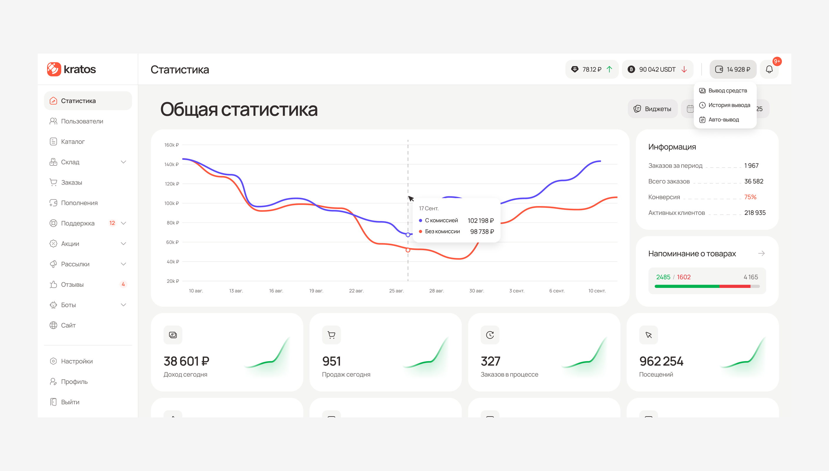
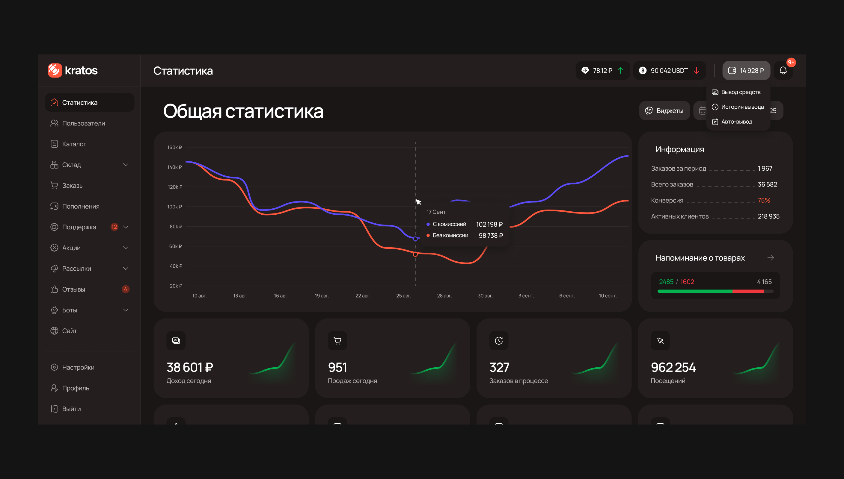
Operational overview
The dashboard had to show what changed, not just what happened
I designed a configurable dashboard for comparing sales and inventory trends. Operators can inspect exact values, reorder or hide widgets, and trace an Item’s contribution through linked charts and lists.
Catalogue model
One catalogue had to connect content with individual keys
Optional hierarchyCategory and Section are optional and organise products .
ItemThe customer-facing offer with a name, image, description and price.
ProductAn individual key or other unit of stock linked to its Item.
My task was to make the relationship between customer-facing offers and individual stock units clear in the interface. I designed separate creation flows for Items and Products, with stock entry linking keys to their Item and responsible operator.
The interface also supports a flat catalogue: Category and Section remain optional, so merchants can add structure when needed.
Sales channels
One catalogue had to work wherever customers buys
Each merchant can configure one website and unlimited Telegram bots around the same catalogue, orders and support. I split website settings into focused tabs, keeping save and reset actions in context without adding a separate publishing workflow.
Responsive tables
When tables lose space, the hierarchy still has to work
Essential columns stay visibleFocused overview
Complete record in DetailsFull access
Desktop and narrow layoutsOne responsive pattern
Dense tables needed to remain usable as space narrowed. On smaller screens, I kept a compact set of columns for scanning records and moved the complete record into Details, alongside shared rules for copying values, opening linked records and accessing row actions.
Exception handling
When automation stopped, operators still needed context
Paid order cannot completeManual fallback
Website, order and TelegramOne shared queue
Named target and visible severityConfirm consequences
I designed the manual paths operators need when automatic fulfilment cannot complete. Manual fulfilment and refunds stay in Orders, while replacements stay in Support alongside the customer conversation.
For high-impact actions, I added confirmations that identify the affected record or selection. This keeps the action connected to its context and gives operators a chance to check the target before proceeding.
Platform operations
Payment exceptions in a separate owner workspace
The platform team manages providers, balances and payment exceptions in a separate workspace. I kept the user’s message, transaction details, attachments and current status together so operators could investigate each case without switching context.
Operators can contact the user directly from the payment record before deciding whether to approve or reject the request.
Access and accountability
Granular access and logs built for investigation
Permissions across all areasConfigure access
Different events need different dataSplit by domain
Links to affected recordsInvestigate in context
Operators have individual permissions across 16 product areas, with different controls for Support and Warehouse. This gives precise access control, but creates more settings to configure.
For logs, I split activity by domain so each view exposes relevant fields and links to affected records. Investigations gain specific context, while activity across domains remains in separate views.
Design system
Shared components across products and themes
Primitive tokensStore raw foundations such as colour, spacing, radius and stroke.
Semantic tokensExpress meaning for backgrounds, text, icons, feedback and themes.
Alias tokensBind decisions to a specific component, element or state.
I published a shared Figma library for the Kratos ecosystem. Basic tokens store raw values, semantic tokens express their purpose, and alias tokens connect those decisions to specific component properties and states.
This structure supports shared components across Light and Dark themes and desktop, tablet and mobile layouts.
What I Delivered
As the sole product designer, I delivered merchant and platform-owner workflows, customer-facing interfaces and a published Figma library.
Working with the stakeholder and two engineers, I carried the design through annotated flows and implementation reviews, connecting individual screens into a consistent system.
UnitBank
See Next
DesignRush Award Winner
The UnitBank case is not ready yet, but you can see it on Behance
The UnitBank case is not ready yet, but you can see it on Behance
See on Behance